
12 Mind-Blowing Small Bathroom Colors That Actually Work
Dealing with a small bathroom? It often feels like trying to decorate a closet. You want a high-end look, but you’re terrified of making the space feel like a claustrophobic box. We have all been there—staring at paint swatches, wondering if "Naval Blue" is a genius move or a terrible mistake. But here is the secret: Color is your best tool. The right shade can visually push walls back, raise the ceiling, and turn a cramped quarter into a cozy sanctuary. Ready to stop hating your square footage? Put down the sledgehammer and pick up a roller. Here are 12 color strategies that will completely transform your tiny bath.
BATHROOM
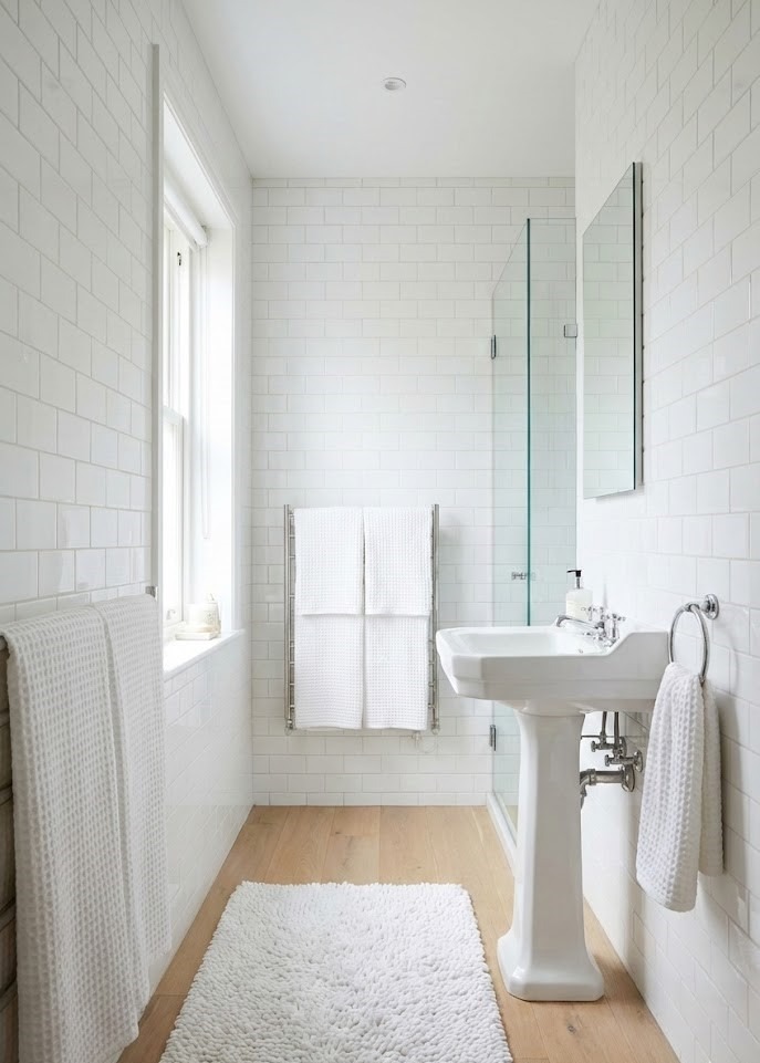
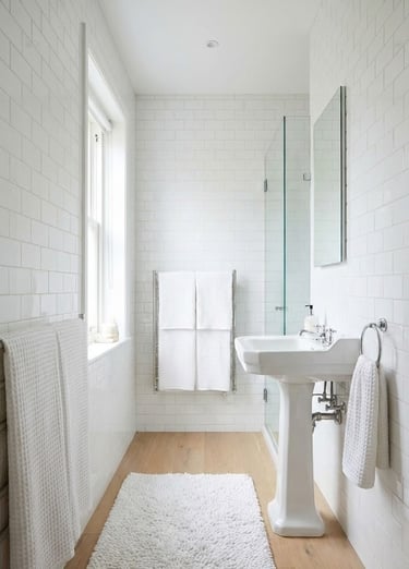
1. The Ultimate Expander: Crisp, Clean White
There is a reason white is the gold standard for small spaces. It is pure, reflective, and airy. However, the goal is "luxury spa," not "sterile hospital."
Why it works:
Maximal Light Reflection: White bounces light into every corner, erasing shadows that make a room feel small.
Versatility: It serves as a blank canvas for literally any accent color.
The Clean Factor: Nothing feels fresher than a sparkling white bathroom.
Design Tip: To keep it interesting, focus on texture. Pair white walls with high-gloss subway tiles, fluffy chenille bath rugs, or waffle-knit towels to add depth without darkening the room.
Categories
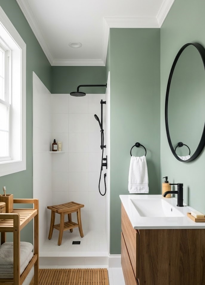
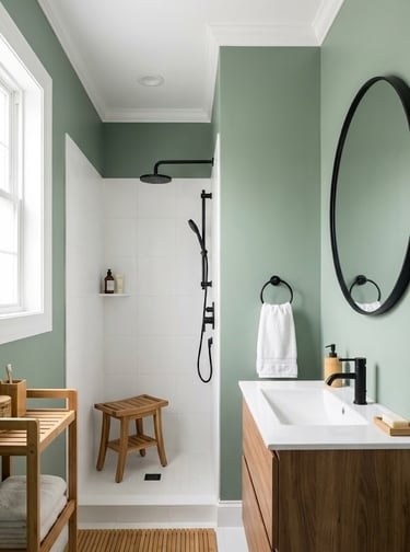
2. Nature’s Neutral: Calming Sage Green
If white feels too boring, look to nature. Sage green is having a massive moment in interior design because it bridges the gap between color and neutral.
Why it’s a winner:
Serenity: Green is scientifically proven to be the most restful color for the human eye.
Sophistication: The grey undertones in sage keep it looking expensive, not cartoonish.
Biophilic Design: It pairs perfectly with wood accents, bamboo accessories, and matte black hardware.
Try this: Combine sage walls with a crisp white trim and a teak shower stool for an instant organic oasis.
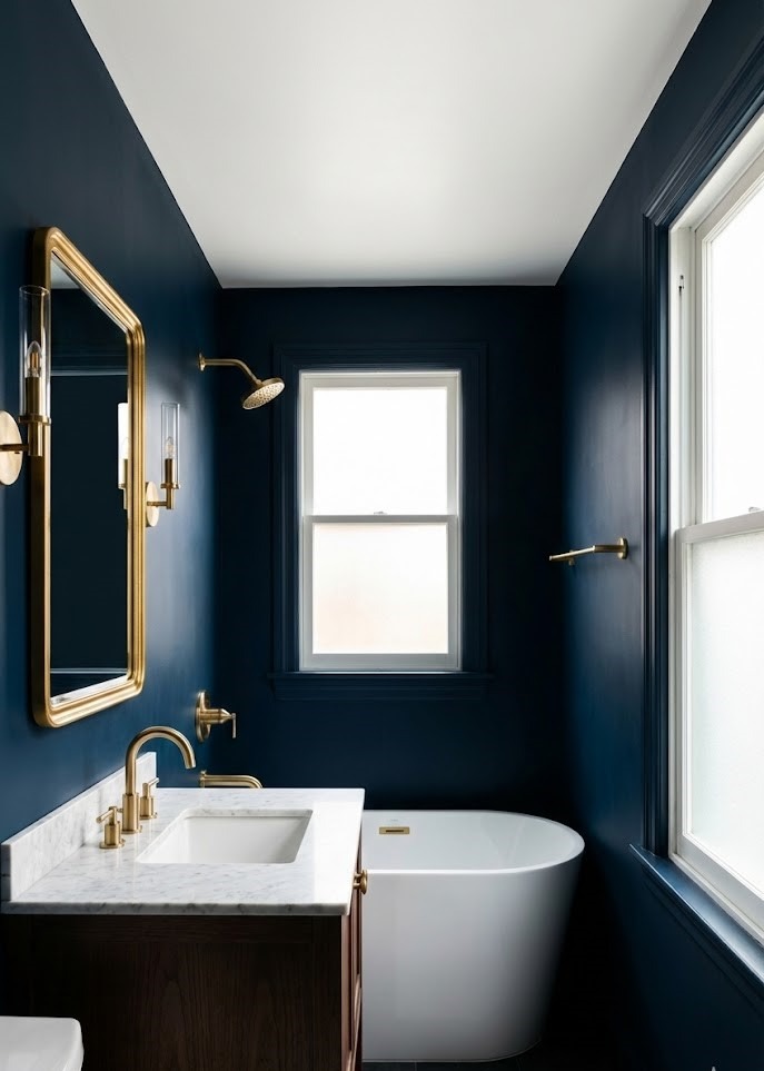
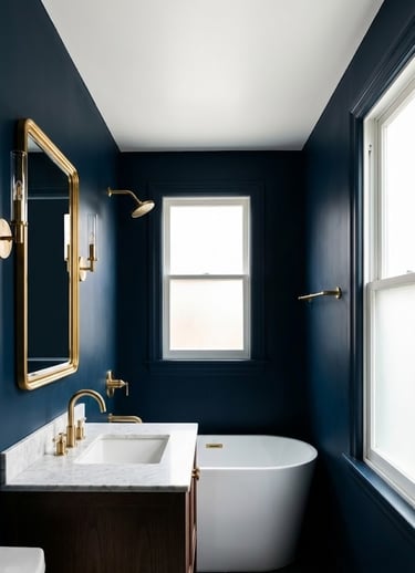
3. Deep Drama: Sophisticated Midnight Blue
Conventional wisdom says "avoid dark colors in small rooms." Conventional wisdom is wrong. Dark colors can actually blur the boundaries of a room, creating an infinite, cozy feel.
Why you should be brave:
The Blur Effect: Dark corners recede visually, making it harder to tell where the walls end.
Intimacy: It creates a wrapping, jewel-box effect that is perfect for a relaxing bath.
Luxury: Navy or midnight blue looks incredible against brass or gold fixtures.
Pro Tip: Keep the ceiling bright white to prevent the "cave effect," and invest in good vanity lighting.
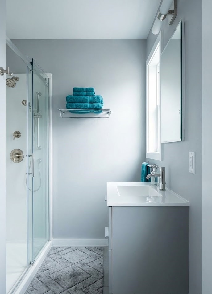
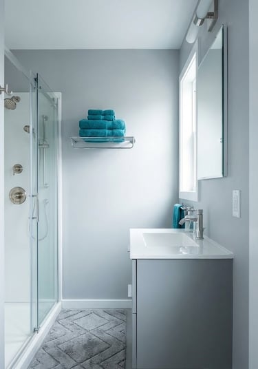
4. Modern Minimalist: Cool Icy Grey
For those who want the brightness of white but with a modern edge, cool grey is the answer. It is sharp, sleek, and effortlessly contemporary.
Why it fits:
Airy Atmosphere: It mimics the openness of the sky on a cloudy day.
Fixture Friendly: It is the perfect backdrop for chrome or polished nickel faucets.
Pop of Color: It allows vibrant accessories (like teal towels or a bright rug) to shine without overwhelming the eye.


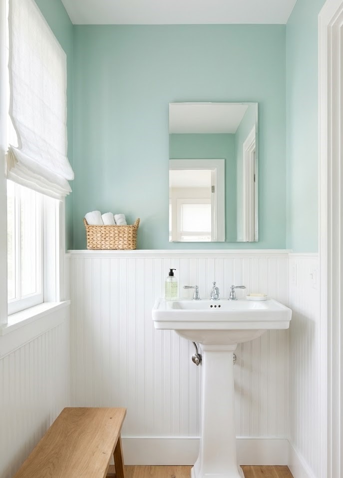
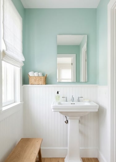
9. Coastal Breeze: Refreshing Seafoam Green
This isn't about kitschy beach themes; it's about capturing the essence of water. Seafoam is a delicate blend of blue and green that feels inherently clean.
Why it works:
Spa Vibes: It evokes the feeling of a high-end wellness retreat or a seaside escape.
Cooling Effect: The blue undertones visually "cool" the room, making it feel more spacious.
Pairing: It looks crisp against white shiplap or beadboard paneling.
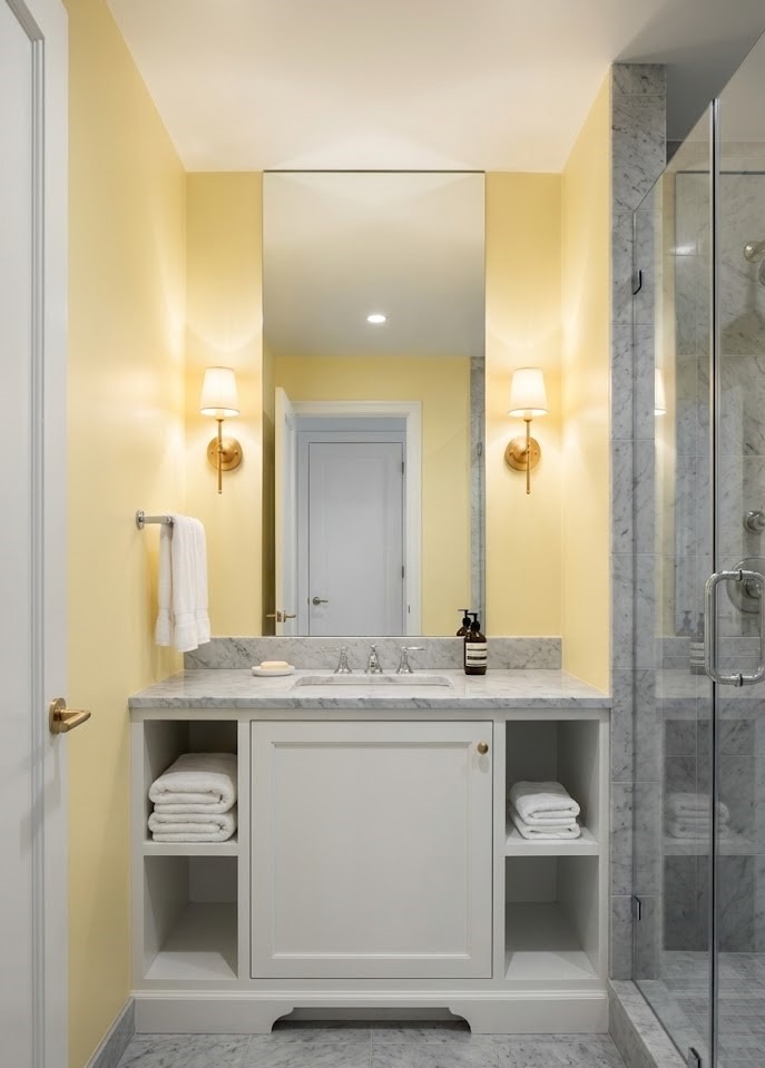
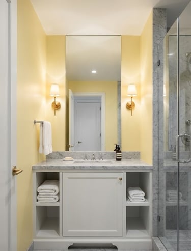
10. Sunshine Vial: Buttery Pale Yellow
Small bathrooms often lack windows. A soft, pale yellow can mimic natural sunlight, injecting energy into the space the moment you walk in.
How to get it right:
Go Pale: Think "lemon chiffon" or "buttercream," not "school bus yellow."
Morning Boost: It creates a happy, welcoming vibe for your morning routine.
Combo: It looks surprisingly chic when paired with grey tiles or marble.
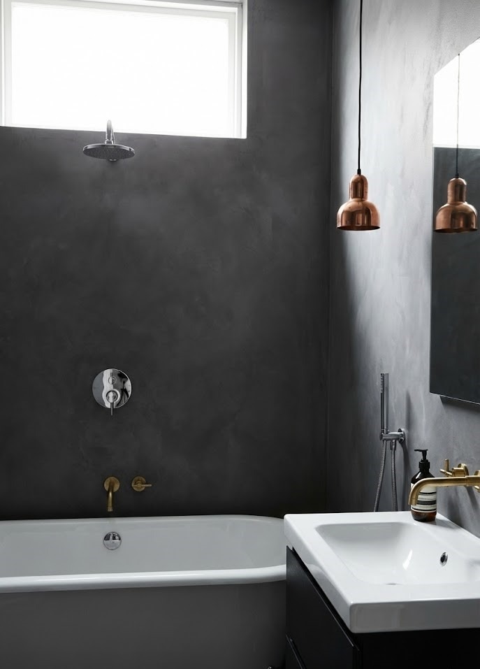
6. Sharp & Sleek: Moody Charcoal
If black feels too intense but grey feels too safe, charcoal is your happy medium. It offers depth and moodiness while retaining a softness that stark black lacks.
Why it rocks:
Contrast King: Charcoal walls make white porcelain sinks and tubs pop visually.
Forgiving: Unlike white, darker greys are excellent at hiding minor splashes or dust.
Metal Mixer: It looks stunning with both warm metals (copper, brass) and cool metals (chrome).
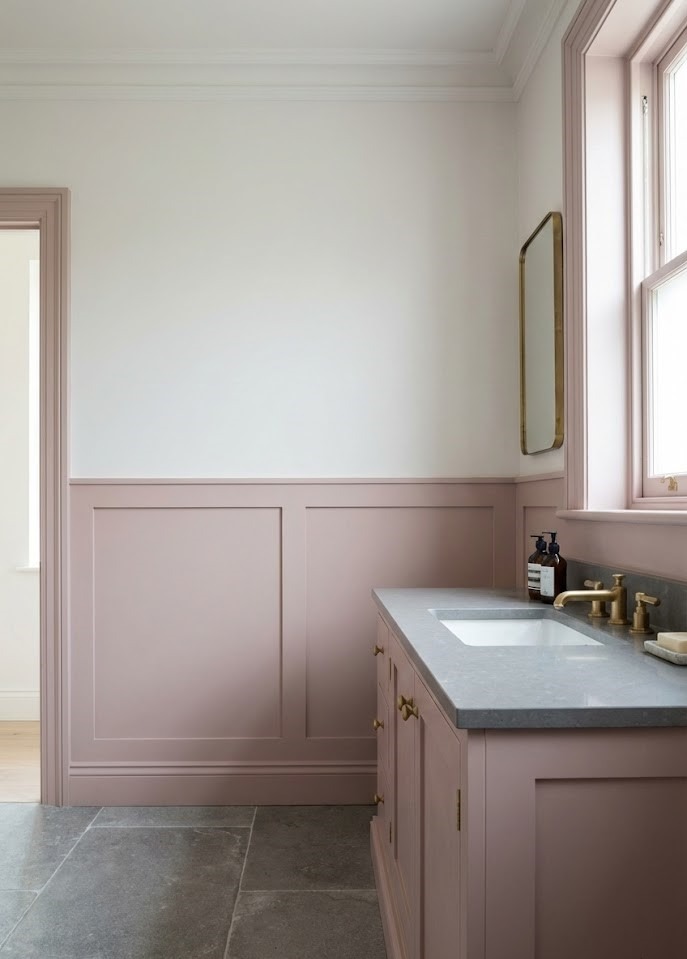
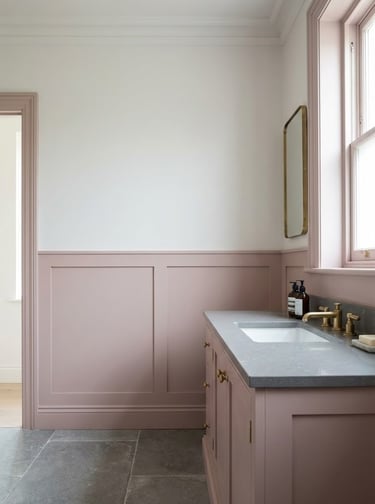
7. Grown-Up Elegance: Muted Powder Pink
Pink is no longer just for nurseries. When chosen correctly, a dusty, muted pink creates a flattering, warm glow that makes everyone look good in the mirror.
How to keep it chic:
Desaturate: Avoid bubblegum brights. Go for "blush" or "plaster" pinks that have a bit of brown or grey in them.
Balance: Pair it with heavy elements like stone countertops or grey tiles to ground the sweetness.
Wainscoting: If painting the whole room pink scares you, try painting just the bottom half of the wall or the vanity cabinet.
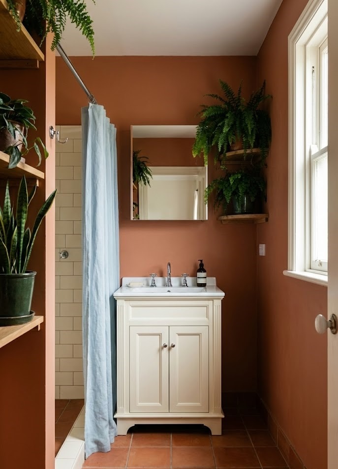
8. Rustic Warmth: Earthy Terracotta
Want a bathroom that feels like a vacation? Terracotta brings the heat and heart of the earth right into your home.
Why it stands out:
Instant Character: It adds a rustic, artisanal vibe that feels lived-in and comfortable.
Grounded: It pairs beautifully with creamy whites and deep greens (like plants!).
Floor or Wall: Terracotta works equally well as a wall paint or as a floor tile color.
Design Tip: Balance this warm tone with cool accents, like a pale blue shower curtain or silver fixtures, to keep the room feeling fresh.
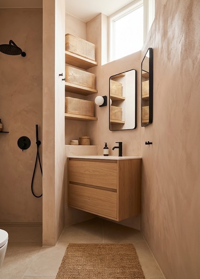
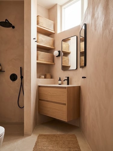
5. Warm & Earthy: The New Sand Beige
Forget the boring "builder beige" of the 1990s. The new wave of beige is sandy, warm, and textured. Think "desert chic" or "Mediterranean coast."
How to style it:
Undertones Matter: Look for beige with pink or grey undertones to avoid the yellow-brown look.
Texture is Key: This color screams for natural materials. Use rattan storage baskets, seagrass mats, or light oak wood to create a high-end aesthetic.
Black Accents: Ground the airy beige with matte black fixtures for a modern industrial touch.
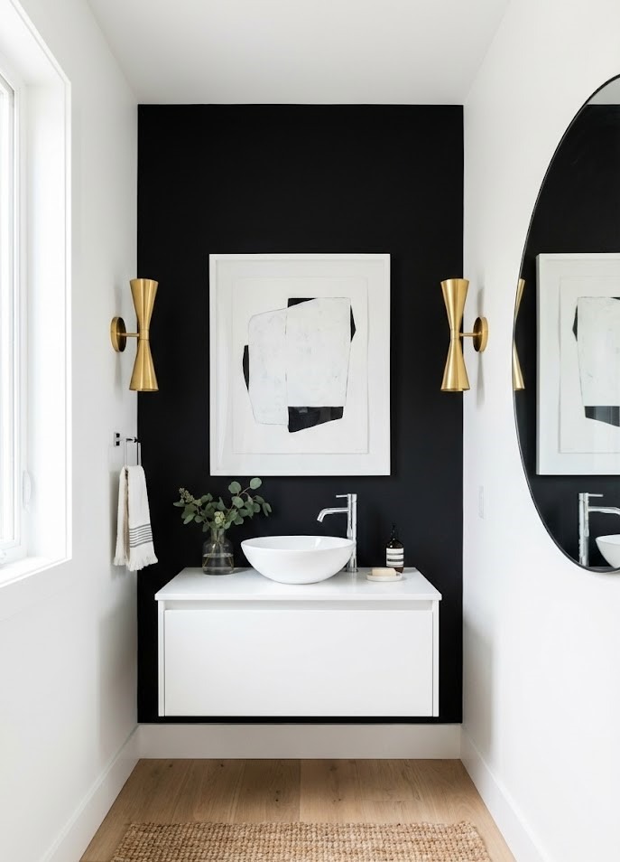
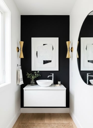
11. The Bold Move: A Stark Black Feature Wall
If you want high impact, paint one wall black. It sounds counter-intuitive, but a single black wall creates a focal point that creates incredible depth.
Why try it:
Receding Wall: The black wall will appear to recede, visually lengthening the room.
Backdrop: It is the perfect background for a white vanity or a piece of art.
Lighting: Just ensure you have strong lighting fixtures so the wall absorbs the light without dimming the room.
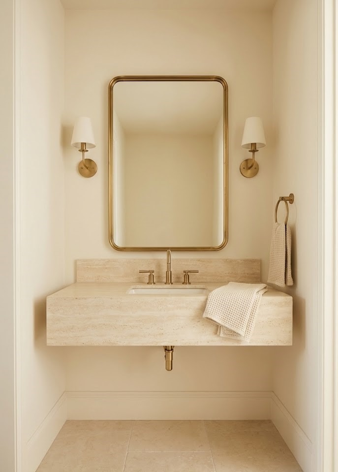
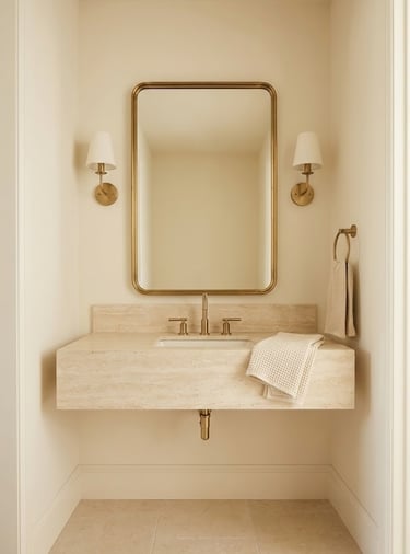
12. Soft Glow: Creamy Off-White
Sometimes bright white is just too harsh on the eyes. Off-white or cream offers the same light-reflecting benefits but with a cozy, velvety finish.
Why it’s a classic:
Warmth: The yellow or peach undertones make the space feel inviting rather than clinical.
Timeless: It never goes out of style and works with any decor change you make in the future.
Luxe Look: Cream looks exceptionally high-end when paired with natural stone and brass.
Conclusion
Who knew a simple can of paint could pack such a punch? The biggest takeaway here is simple: Don’t let limited square footage limit your style.
Whether you choose to expand the space with crisp whites and cool greys, or embrace the cozy "jewel box" feel with midnight blues and terracottas, the right color changes the entire psychology of the room.
Remember the golden rules:
Light reflection helps the space feel open.
Contrast adds necessary depth.
Texture prevents the room from feeling flat.
So, which color is calling your name? Grab a few sample pots, test them on your walls, and watch how they change with the light throughout the day. Your dream bathroom is just a coat of paint away.