
Pantone Unveils Cloud Dancer as the 2026 Color of the Year: A Return to Serenity
Pantone has taken a surprising turn for 2026, moving away from bold maximalism to a new era of serenity. I explore 'Cloud Dancer,' an ethereal white designed to be a mental sanctuary, and share my top tips for layering textures to ensure this minimalist shade feels cozy, not clinical.
NEW YEAR
The design world has spent the last several years oscillating between the high-octane energy of "dopamine decor" and the clutter-core aesthetic of vibrant maximalism. However, Pantone has taken a decisive, unexpected turn for 2026. The newly announced Color of the Year is Cloud Dancer, a light, ethereal white that signals a profound cultural shift toward mindfulness, simplicity, and a "less is more" philosophy.
Far from being "just another neutral" or a sterile builder-grade white, this shade is designed to serve as a calm foundation for a world seeking a reset. Cloud Dancer is described by color theorists as a "lofty" white—it possesses a weightlessness that provides a mental sanctuary. It represents a collective desire for stillness, offering a blank canvas that encourages innovation and genuine rest.
To bring this mood to life, Pantone has already collaborated with brands like Joybird for furniture and Spotify for atmospheric audio pairings, proving that this white is intended to be an immersive lifestyle experience rather than a mere background color. It challenges homeowners to look at white not as the absence of color, but as the presence of light and possibility.
Here is how design experts suggest incorporating this pivotal shade into your home, ranked by its impact on modern interior styling.
1. Establishing a Foundation of Emotional Wellbeing
The primary reason Cloud Dancer is resonating with designers is its ability to create a "haven" effect. We are living in an era of digital saturation, where our eyes are constantly bombarded by pixels and notifications. Unlike the stark, clinical whites of the early 2000s (which often leaned blue and cold), Cloud Dancer is rooted in the principles of slow living. Experts note that because it is free from distracting undertones, it fosters a sense of "visual stillness."
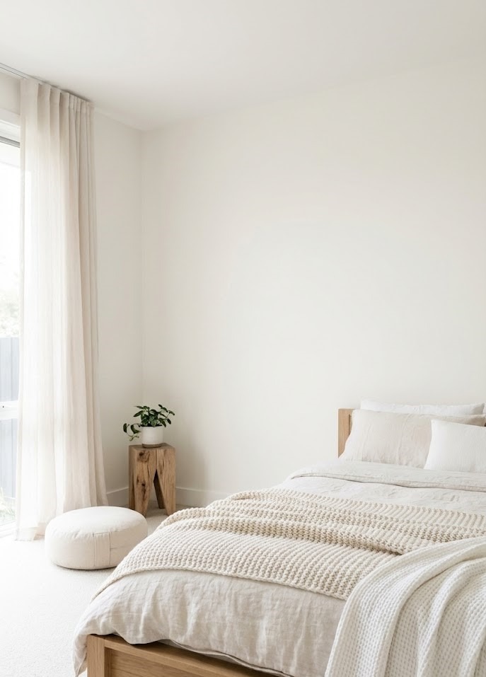
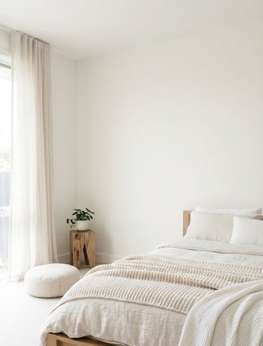
The Psychology of the Shade In a fast-paced, hyper-connected world, using a pure, airy white helps to reduce the "busyness" of a room. It functions as a visual palate cleanser. When the eye has less to process in terms of patterns and saturated hues, the brain can relax. This provides an emotionally reassuring backdrop that allows the mind to decompress, making it the ideal choice for bedrooms and meditation corners.
How to Implement It:
Lighting Matters: To maximize the emotional benefits, avoid cool-toned LED bulbs (4000K+). Instead, pair Cloud Dancer walls with warm lighting (2700K to 3000K). The warmth of the bulb will interact with the lofty white to create a soft, glowing cocoon in the evening.
Declutter First: This color demands a certain level of tidiness. It highlights objects, meaning clutter becomes more visible. Use this color change as an opportunity to edit your possessions, keeping only what is functional or beautiful.
Categories
2. Mastering the Art of Layered Neutrals
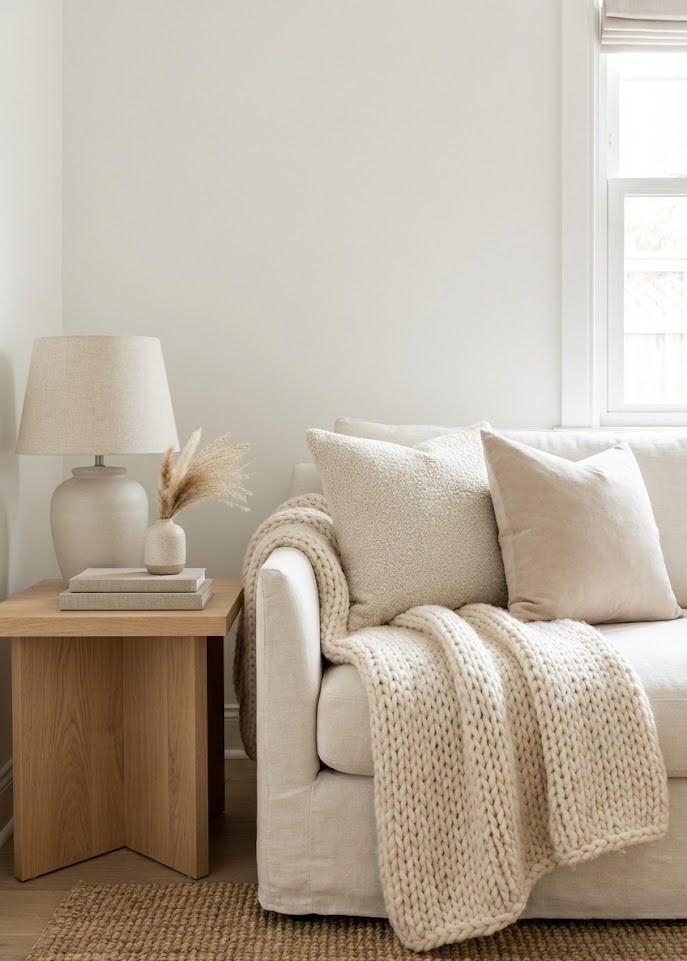
One common misconception is that a white room feels flat, boring, or unimaginative. However, industry leaders emphasize that Cloud Dancer is actually "a thousand tones in one." The success of this aesthetic relies entirely on nuance. The key to making this color work is layering.
The Texture-Over-Color Approach By mixing Cloud Dancer with various off-whites, creams, and tactile textures—such as linen, wool, and light woods—you create a space that feels expensive and sophisticated rather than empty. This approach nurtures a sense of depth and warmth without the need for dominating pigments.
Material Checklist for 2026: To achieve a high-end, editorial look using Cloud Dancer, incorporate the following materials:
Bouclé and Shearling: These nubby fabrics catch the light, creating shadows that add visual weight to white furniture.
Travertine and Limestone: Instead of high-gloss marble, opt for porous, matte stones in sandy beige tones to bridge the gap between the white walls and the floor.
Bleached Woods: White oak or ash wood introduces a natural grain that prevents the room from feeling like a hospital.
Pros and Cons of the Layered Look:
Pro: It is timeless. A layered neutral room rarely looks "dated" and allows you to swap out small accessories easily.
Con: It requires strict discipline. Introducing a bright red or neon blue item into a layered neutral room can break the harmony instantly.

3. Creating Spaciousness in Functional Rooms
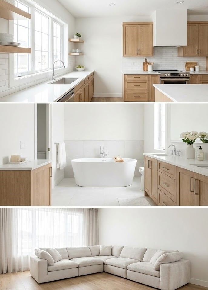
Because of its expansive quality, Cloud Dancer is a powerful tool for opening up smaller or high-traffic areas. White has the highest Light Reflectance Value (LRV) of any color, meaning it bounces natural light deeper into a room, making square footage feel significantly larger than it is.
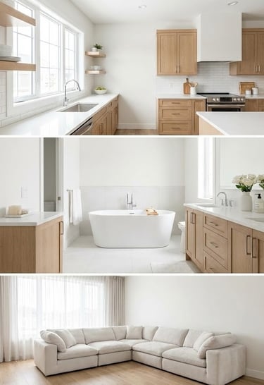
The Kitchen When paired with Scandinavian design elements, such as light oak or stainless steel, Cloud Dancer creates a refined and purposeful look.
Styling Tip: Use Cloud Dancer on upper cabinets to make the ceiling feel higher, but consider a slightly darker putty or greige for lower cabinets to ground the space and hide scuff marks. Matte black or brushed brass hardware pops beautifully against this airy backdrop.
The Bathroom It lends a "spa-like" softness that feels clean but inviting.
Styling Tip: Move away from subway tile. Pair Cloud Dancer walls with handmade Zellige tiles in varying shades of white. The irregularity of the tile reflects light in different directions, adding a shimmering, aquatic quality to the room.
The Living Room On large pieces of furniture, like a plush sofa, this shade acts as a "chameleon," blending seamlessly into any existing decor while making the entire room feel lighter and more elevated.
Practicality Note: Many homeowners fear white sofas. To make this practical for real life (kids and pets included), look for "Performance Fabrics" or Crypton technology. These are stain-resistant and often bleach-cleanable, allowing you to embrace the Cloud Dancer aesthetic without anxiety.
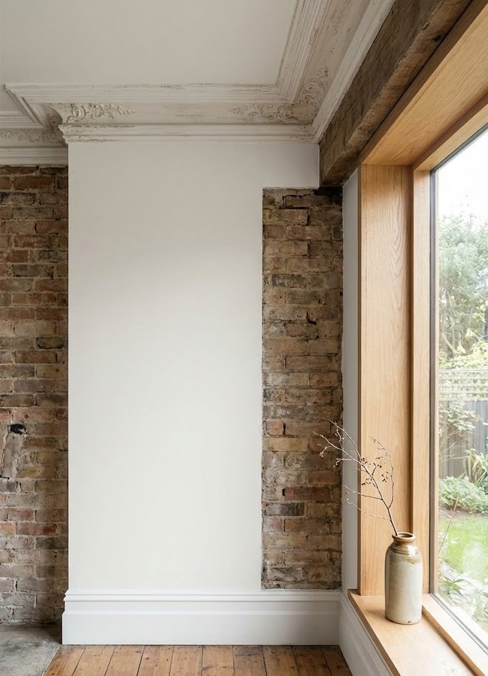
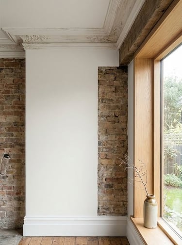
4. Highlighting Architectural Details and Natural Textures
Cloud Dancer acts like a spotlight for the craftsmanship in your home. Because the color itself is so subtle, it draws the eye to the "bones" of a room—think crown molding, exposed brick, or the grain of a hardwood floor. It allows natural materials to take center stage, making it a favorite for those who appreciate organic minimalism and timeless architecture.
Shadow Play and Finishes In a room painted with a saturated color, shadows get absorbed. With Cloud Dancer, shadows become a design element. The play of sunlight across a plaster wall or a fluted column becomes dynamic art that changes throughout the day.
Choosing the Right Finish:
Matte/Flat: Best for walls and ceilings to create that velvety, "cloud-like" texture. It hides imperfections in drywall.
Eggshell/Satin: Ideal for high-traffic areas as it is easier to wipe down while still retaining a soft appearance.
Semi-Gloss: Use this strictly for trim, baseboards, and molding. The slight shine creates a subtle contrast against the matte walls, framing the room elegantly.

Conclusion
Pantone’s choice of Cloud Dancer for 2026 marks a significant cultural pivot away from the loud and the cluttered toward the quiet and the intentional. It is a color that celebrates the power of the "blank canvas," offering homeowners a chance to breathe and redefine their spaces with clarity.
This is not a directive to erase your personality; rather, it is an invitation to curate it. Whether you use it to create a minimalist Scandi-retreat defined by texture, or as a crisp backdrop for bold, moody accents, Cloud Dancer proves that white is, indeed, one of the most expressive choices you can make for a modern home. It reminds us that sometimes, the boldest design move is simply to clear the air.
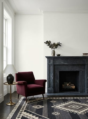
5. Balancing the Palette with Moody Contrast
While Cloud Dancer thrives in a monochrome setting, it also serves as the perfect partner for dramatic contrast. To prevent a space from feeling too ethereal or "floating," designers suggest anchoring it with deep, "grounded" colors.
The Theory of Tension Pairing this soft white with rich tones like burgundy, deep wine, or graphite black creates a "visual tension" that feels modern and high-end. The contrast makes the white look cleaner and the dark colors look richer. For example, Cloud Dancer walls provide a stunning backdrop for a dark marble fireplace or a bold, patterned rug, giving the white a sophisticated "edge" to respond to.
Top Color Pairings for 2026:
Cloud Dancer + Espresso Brown: A nod to 90s minimalism, this combination is warmer and more inviting than black and white.
Cloud Dancer + Deep Aubergine/Plum: This adds a regal, historic feel to a room, perfect for a library or formal dining room.
Cloud Dancer + Olive Green: brings the outdoors in, grounding the airy white with an earthy, biological element.
How to Balance: Apply the 80/20 rule. Let Cloud Dancer and other neutrals dominate 80% of the room (walls, major furniture, rugs), and use the moody contrast colors for the remaining 20% (throw pillows, art frames, accent chairs, or lamps). This ensures the room remains serene while still having character.