Radiant Living: 17 Creative Ways to Use Yellow for a Cheerful, Cozy Home
Is your home feeling uninspired? I believe yellow is the secret to a cheerful space. From bold mustard accent walls to soft buttery neutrals, I’m sharing 17 creative ways to use this sunny hue to transform your home.
LIVING ROOM
Let’s be honest: walking into a room that feels dull or uninspired can instantly drain your energy. We often underestimate how much our environment dictates our mood. If you’ve been staring at your living room feeling like it needs a "soul," or if your space feels technically "correct" but emotionally cold, yellow might be the secret ingredient you’ve been missing.
Often overlooked because people fear it might be too "loud" or difficult to coordinate, yellow is actually one of the most versatile colors in a designer’s toolkit. It ranges from the softest, barely-there creams to deep, moody ochres. It is the color of optimism, clarity, and warmth.
From soft honey tones to bold mustards, this color family can transform a cold, sterile space into a sun-drenched sanctuary. Whether you are a maximalist ready for color or a minimalist looking for a subtle shift, here are 17 ways to integrate this happy hue into your home, ranging from subtle accents to bold transformations.
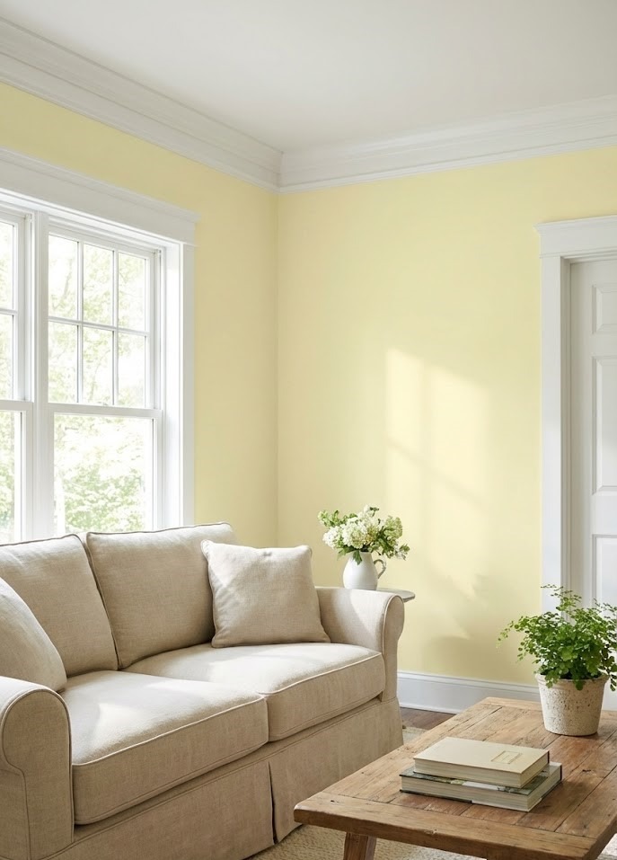
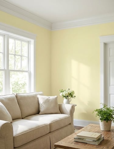
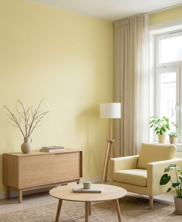
1. Soft Buttery Walls with Clean White Trim
If you want to dip your toes into the yellow trend without overwhelming your senses, start with a buttery, pale yellow. This shade acts almost like a neutral but with an added layer of warmth that standard beige or gray lacks. When paired with crisp white molding and trim, the room feels fresh, airy, and timeless.
Why This Works: In color psychology, pale yellow mimics the effect of natural sunlight. This is particularly effective in north-facing rooms that tend to get cool, bluish light. The yellow pigment counteracts the cool shadows, making the room feel perpetually sun-drenched.
The Best Finishes: For the walls, opt for an eggshell or matte finish to keep the look velvety and soft. For the white trim, use a semi-gloss to create a slight textural contrast that highlights the architectural details.
Design Note: This combination works exceptionally well in traditional, farmhouse, or cottage-style homes where warmth and hospitality are the primary goals.
Categories
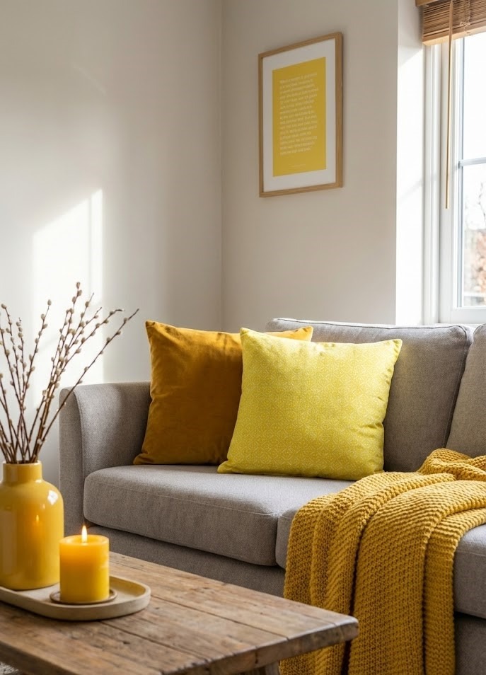
2. Introduce Energy with Yellow Accessories
Not ready to pick up a paintbrush? That is completely fine. You can use "low-stakes" decor like throw pillows, vases, and blankets to inject energy into a room without a permanent commitment. This allows you to test different shades of yellow to see how they react with your current lighting and furniture.
How to Layer: Don't just stop at one item. Use the "Rule of Three" to make the color feel intentional rather than accidental. For example, place a yellow ceramic vase on the mantel, a yellow throw blanket on the sofa, and a stack of books with yellow spines on the coffee table.
Pro Tip: Mix different tones and textures. A mustard velvet pillow next to a lemon-colored candle creates a curated, high-end look. This tonal variation prevents the decor from looking "matchy-matchy" or flat.

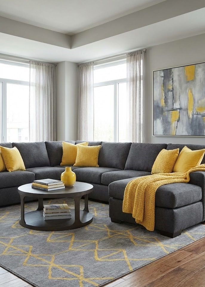
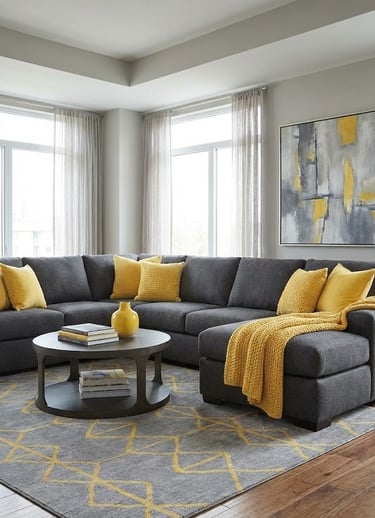
3. The Timeless Balance of Yellow and Gray
Yellow and gray are a match made in design heaven. This combination has remained popular for decades because it represents the perfect equilibrium between warmth and cool tones. The cool, grounding nature of gray keeps the yellow from feeling "childish" or overly energetic, while the yellow prevents the gray from looking gloomy or institutional.
Design Idea: Try a charcoal gray sectional paired with sunshine-yellow accents for a modern, sophisticated vibe. The dark gray anchors the room, allowing the yellow to pop as a highlight.
Material Pairing: To elevate this look, mix industrial materials with soft textures. Think concrete gray planters or slate coasters paired with soft yellow wool throws.
Caution: Ensure you pick a gray with the right undertones. A blue-based gray looks crisp with lemon yellow, while a warm "greige" pairs better with mustard or ochre.
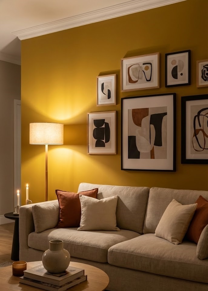
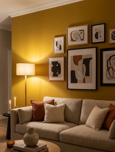
4. A Bold Mustard Accent Wall
For those who want a focal point, a mustard yellow accent wall is a game-changer. Unlike bright primary yellow, mustard is sophisticated, earthy, and historically rich. It provides a stunning, high-contrast backdrop for art or a neutral sofa.
Key Feature: Mustard yellow has a depth that looks incredible under warm evening lighting. While bright yellows can become garish at night, mustard becomes cozy and enveloping.
Styling Advice: Treat the wall as a gallery. Black and white photography in sleek black frames pops incredibly well against a mustard background. Alternatively, hang a large mirror to reflect light and double the impact of the color.
Best Placement: The wall behind a bed or the wall behind the main sofa are the two best candidates for this treatment.
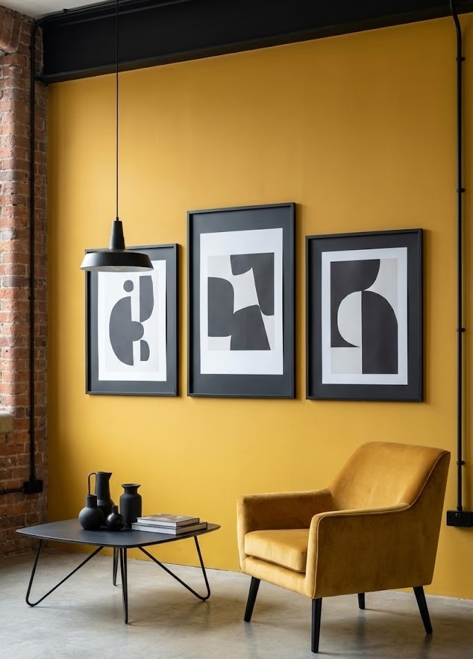
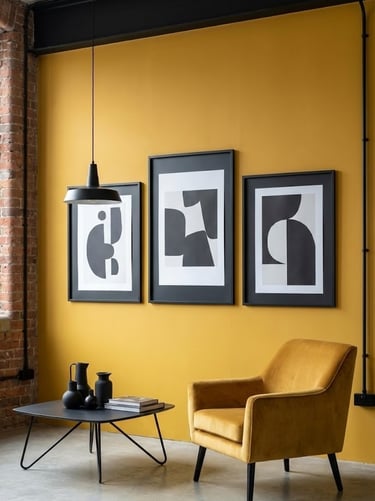

9. Modern Edge with Goldenrod and Black
If your style is more industrial, urban, or modern, try pairing goldenrod yellow with matte black accents. The contrast is sharp, graphic, and fashion-forward. This is not a shy color combination; it is for the bold decorator.
How to do it: Use black picture frames, light fixtures, or coffee table legs against a yellow backdrop. The black acts as an outline, sharpening the softness of the yellow.
Avoid the "Bumblebee" Effect: To avoid looking like a hazard sign, vary the textures. Use matte black metal against a soft, woven goldenrod textile. Add a third neutral, like white or concrete gray, to break up the intensity.
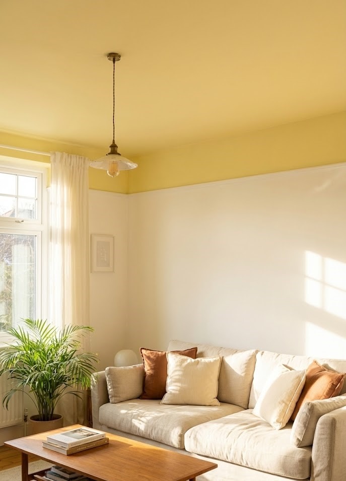
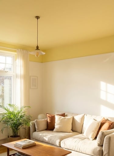
10. The "Hidden" Glow: A Yellow Ceiling
Painting the "fifth wall" (the ceiling) a soft, pale yellow is a designer secret for creating a perpetual "golden hour." It draws the eye upward and makes the room feel cozy and sun-kissed.
Where to Use It: This works wonderfully in kitchens, porches, or bathrooms. In a room with white walls, a yellow ceiling reflects warm light down onto the occupants, making skin tones look healthier and the room feel inviting.
The Trick: Do not use the same saturation on the ceiling as you would on a wall. Cut your chosen yellow paint with 50% white to ensure it doesn't feel heavy or oppressive overhead.
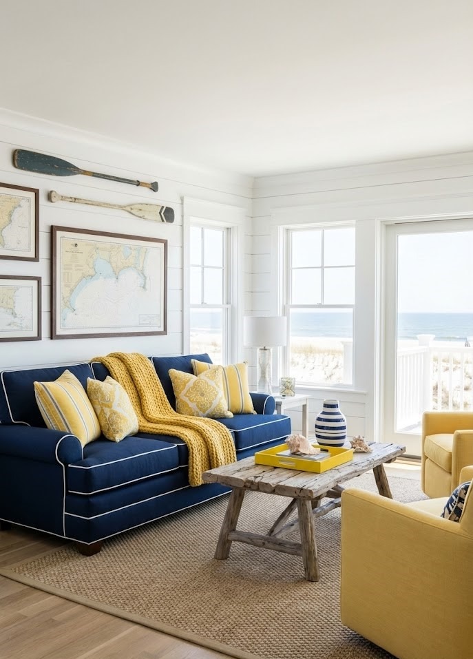
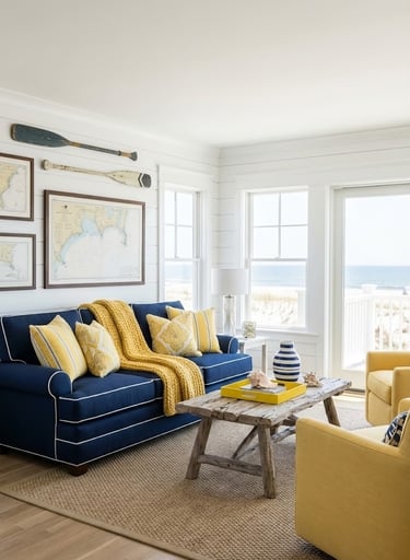
6. Coastal Vibes with Navy Blue and Yellow
If you love a classic, "preppy" look, combine navy blue with yellow. This pairing feels like a summer day at the beach or a classic nautical getaway. The deep navy grounds the space, while the yellow adds the necessary "pop" of brightness.
The Ratio: To keep it looking sophisticated rather than like a sports team uniform, abide by the 80/20 rule. Let Navy be the dominant color (80%)—used on sofas, rugs, or walls—and use Yellow as the accent (20%) in piping, pillows, or flowers.
Pattern Play: This color duo begs for patterns. Stripes, gingham, and geometric prints work beautifully here. A navy and white striped rug with a bright yellow ottoman is a classic coastal setup.
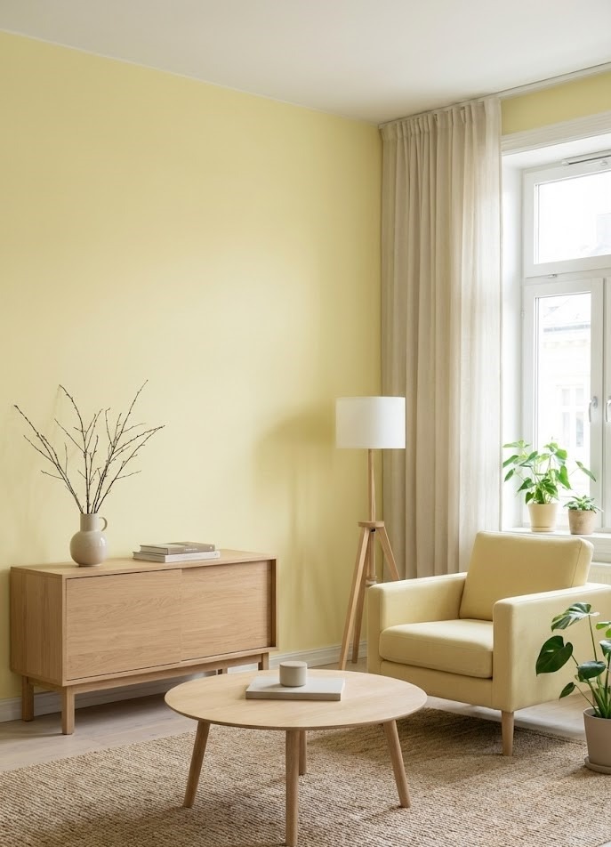
7. Scandinavian Simplicity: Pale Lemon and Natural Wood
For a clean, minimalist look, pair pale lemon yellow with light woods like oak, ash, or birch. This combination is a staple of Scandinavian design—it’s bright, functional, and deeply calming without being boring.
Essential Element: Keep the furniture lines clean and clutter to a minimum to let the colors breathe. The yellow here should be a whisper, not a shout.
Texture Focus: Since the colors are light, texture is crucial to prevent the room from feeling flat. Incorporate sheepskin rugs, chunky knit blankets, and matte ceramics.
Lighting: This palette thrives in natural light. Keep window treatments minimal (like sheer voiles) to maximize the airy feeling.
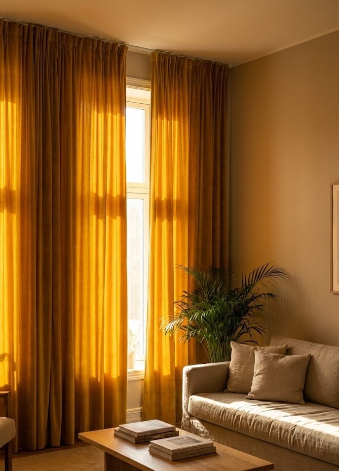
8. Dramatic Yellow Curtains
Framing your windows with yellow drapes is a brilliant way to control the ambiance of a room. When the sun shines through them, your entire living room will be bathed in a warm, golden glow, altering the "temperature" of the room visually.
Fabric Choice Matters:
Sheer Linen: Creates a hazy, dreamlike light. Perfect for living rooms where privacy isn't the main concern.
Heavy Velvet: Blocks light effectively and adds drama. Great for bedrooms or media rooms.
Design Tip: Hang the curtains as high as possible (floor to ceiling) to make the room feel taller. A yellow vertical line draws the eye upward.
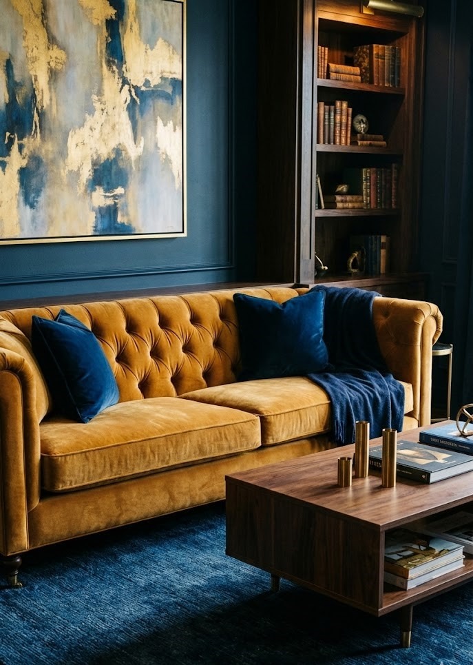
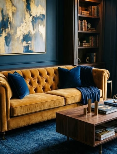
5. The Luxury of a Yellow Velvet Sofa
A velvet sofa in a golden or ochre shade is the ultimate "wow" piece. Velvet adds a tactile richness that makes the color shift and glow depending on the light. It takes a fun color and makes it feel expensive and deliberate.
Pros: A yellow sofa becomes the anchor of the room. It hides dust better than a black sofa and hides stains better than a white one.
Cons: It is a bold commitment. You are effectively marrying this color scheme for the lifespan of the furniture.
Styling Tip: Pair it with dark wood furniture (like walnut or mahogany) and deep blue accents for a high-end, moody aesthetic. The contrast between the warm gold velvet and the dark wood creates a mid-century modern vibe that is very on-trend.


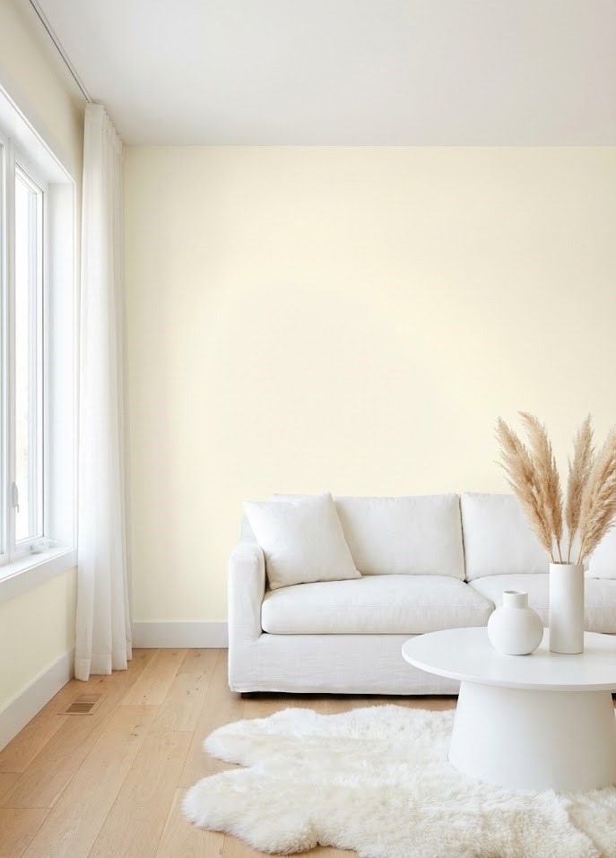
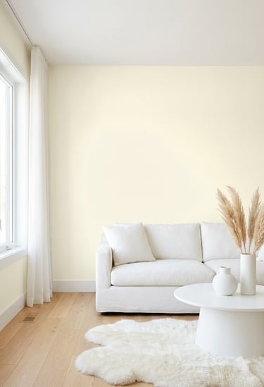
15. The Minimalist Dream: Pale Yellow and All-White
If you love the "all-white" look but find it a bit too clinical or hospital-like, try painting the walls an ultra-pale yellow. It maintains the brightness and light-reflecting qualities of white but adds a layer of "soul" and warmth that makes the space feel lived-in.
The Shade: You are looking for a "cream" or "ivory" with a distinct yellow base.
Contrast: To make the wall color intentional, ensure your trim, ceiling, and linens are a stark, bright white. This subtle contrast shows that the walls are yellow on purpose, not just aged white paint.
Benefits: This creates a clean slate that allows artwork and furniture silhouettes to stand out.
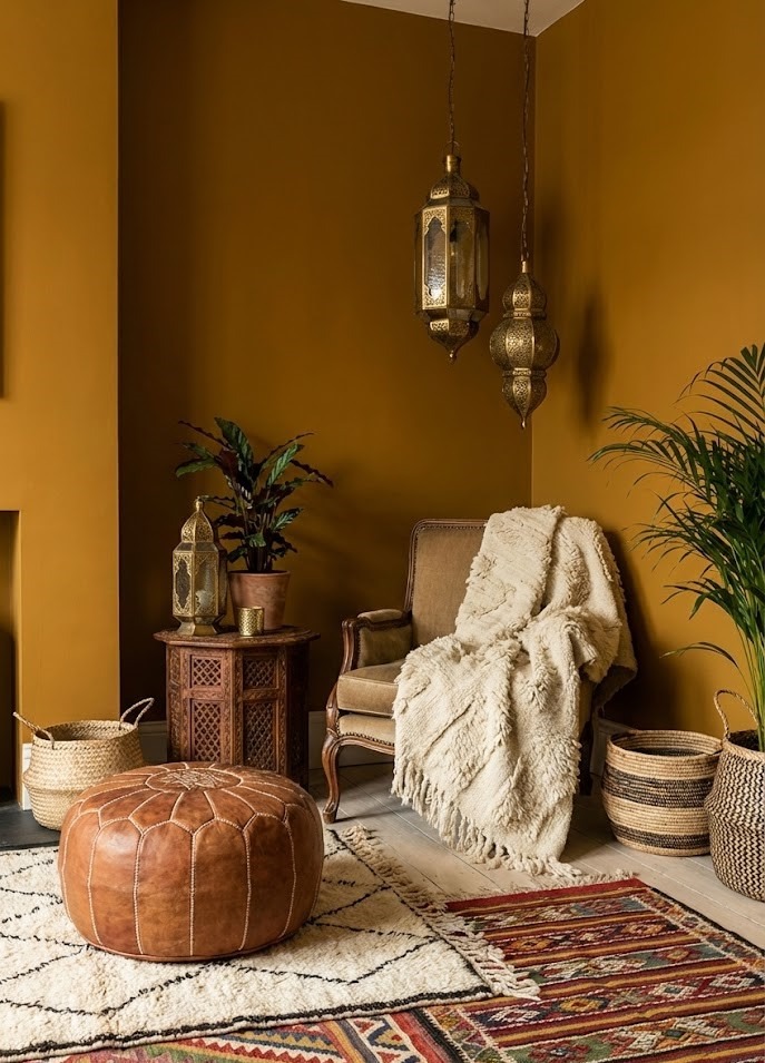
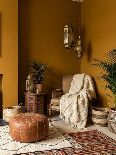

16. Eclectic Ochre with Moroccan Accents
Ochre is a deeper, more orange-toned yellow—think spices like turmeric or saffron. It works beautifully with Moroccan, Bohemian, or Global-inspired decor.
Key Accessories: Think brass lanterns, textured Berber rugs, and leather poufs. The metallic shine of brass or gold complements ochre perfectly.
Layering: This style relies on "more is more." Layer rugs, mix patterned throw pillows, and use warm ambient lighting (like lanterns) rather than harsh overhead lights to bring out the richness of the ochre color.
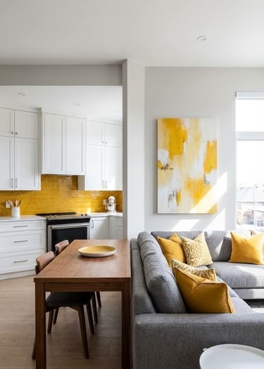
17. Continuity in Open-Concept Spaces
If your living room opens into the kitchen or dining area, use yellow to create flow. Color is a powerful tool for connecting distinct zones in an open floor plan.
The Strategy: Use the concept of "color mapping." A yellow backsplash or island in the kitchen can be echoed by yellow artwork, a rug, or throw pillows in the living area.
The Result: This visual repetition guides the eye through the space, making the entire floor plan feel cohesive and professionally designed rather than disjointed.
Subtlety: It doesn't have to be the exact same shade. A lemon bowl in the kitchen connects to a gold frame in the living room; they just need to belong to the same color family.
Conclusion
Yellow is far more than just a "bright" color; it’s a tool for emotional design. Whether you choose a bold velvet sofa to anchor your living room or a whisper of butter-yellow on the walls to catch the morning light, this hue has the unique ability to make a home feel truly alive.
The key to success is finding the right shade for your light and your lifestyle. Don't be afraid to experiment—paint swatches on the wall, buy a single pillow, or bring home a bouquet of yellow tulips to see how the color makes you feel. Sometimes a little bit of sunshine is all a room needs to reach its full potential.
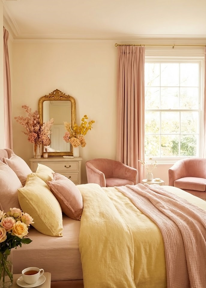
11. Romantic Harmony: Soft Yellow and Blush Pink
This is a trend that is taking over interior design, particularly in "Grandmillennial" or cottage-core styles. The warm undertones of yellow and blush pink harmonize perfectly, creating a soft, romantic, and inviting atmosphere that feels like a sunrise.
The Vibe: This combination is inherently feminine and soothing. It works beautifully in bedrooms, nurseries, or refined living spaces.
Grounding elements: To keep it from looking too sugary, add touches of burnished gold hardware or light rattan furniture.
Floral Accents: This is the perfect palette for floral patterns. A wallpaper featuring pink and yellow florals can serve as the inspiration point for the whole room.
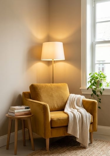
12. Create a Reading Nook with a Yellow Accent Chair
A single yellow armchair can define an entire corner. It’s the perfect way to add personality to a neutral room without committing to a full furniture set. It designates a specific zone for relaxation and joy.
Chair Style: Choose a chair with personality. A mid-century modern wingback or a chubby boucle swivel chair in yellow invites people to sit down.
The Setup: Pair the chair with a floor lamp and a small side table. The yellow chair becomes a destination within the room.
Psychology: Yellow aids in concentration and mental agility, making it a surprisingly good color choice for reading or studying spots.
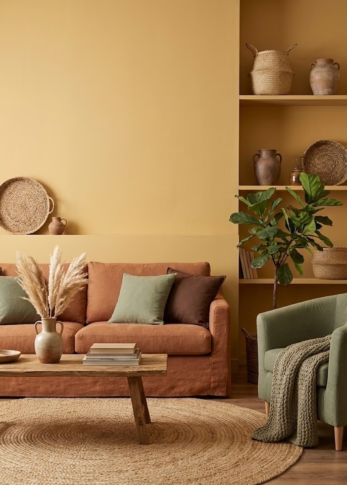
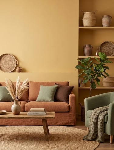
13. Earthy Comfort with Honey Yellow and Terracotta
For a room that feels "grounded" and organic, pair honey-toned yellows with earth tones like terracotta, sage green, and chocolate brown. This palette mimics the colors of nature, specifically a desert landscape or an autumn forest.
Texture matters: Since this look is inspired by nature, the materials must reflect that. Incorporate jute rugs, linen fabrics, unglazed pottery, and leather to enhance the organic feel of this palette.
Biophilic Design: This color scheme pairs perfectly with house plants. The green foliage pops vibrantly against honey and rust tones.
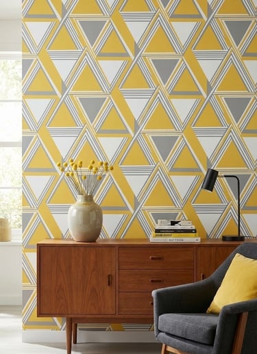
14. Modern Geometry with Yellow Wallpaper
A geometric wallpaper featuring yellow patterns can add movement and energy to a space. It’s a great way to introduce pattern and color simultaneously without painting the entire room solid yellow.
Scale of Pattern:
Small scale: Reads as a texture from far away. Good for full rooms.
Large scale: bold and graphic. Best for feature walls or powder rooms.
Where to Apply: A powder room or an entryway is a fantastic place for bold yellow wallpaper. These are "pass-through" spaces where you can afford to be dramatic because you don't spend hours sitting there.